The Gap Between Knowing and Understanding
Software engineers are remarkably good at memorizing terminology and remarkably bad at understanding mechanics. Most can recite that a B-Tree index provides O(log n) lookups, that Clean Architecture has a dependency rule pointing inward, or that the Builder pattern uses a Director. But ask them to trace the actual flow — the pages read during an Index Scan, the path of an HTTP request through architectural layers, the sequence of calls between pattern participants — and the picture gets blurry.
Static diagrams don't help enough. They show the end state, not the process. A B-Tree diagram has all nodes in place, but doesn't show how the tree became that shape. Clean Architecture circles are beautiful, but they don't show a request traveling through the layers.
Interactive visualization closes this gap. Instead of static images, these are tools where pressing Play reveals the step-by-step mechanics of a system. Below is an overview of six such tools covering databases, message brokers, software architectures, GoF design patterns, Git branching strategies, and algorithms.
How to Use the Visualizers: Step by Step
All visualizers run in the browser with no installation required. The interface is consistent across all six tools:
Step 1. Choose a technology or pattern. Tabs at the top of the page organize content by category. For example, Database Visualizer has PostgreSQL / MySQL / MongoDB / Redis tabs. Pattern Visualizer has Creational / Structural / Behavioral.
Step 2. Select a mode. Each technology has multiple modes. Select buttons below the main visualization area.
Step 3. Press ▶ Play. The step-by-step animation begins. Each step renders in the visualization area and is simultaneously logged in the event panel on the right — with a description of what's happening.
Step 4. Control playback. Pause, step forward/backward, and reset buttons allow stopping at any point to examine details.
Step 5. Explore details. The "Principles & Key Concepts" panel expands on click, providing theoretical context — dependency rules, key concepts, constraints for the current technology.
Step 6. Review the event log. The log panel at the bottom of the visualizer records every animation step — with operation type, description, and timestamp. The log lets you trace the sequence of actions, jump back to any step, and understand exactly what happened at each stage.
Built-in AI Assistant
Every visualizer includes an AI chat assistant (💬 icon in the bottom-right corner), specialized for its specific domain:
- Database Visualizer — answers questions about index structures, performance characteristics, and when to use each index type
- Architecture Visualizer — explains data flows, layers, components, and when to apply each architectural pattern
- Pattern Visualizer — breaks down GoF patterns, their differences, and real-world use cases
- Message Broker Visualizer — explains messaging patterns, delivery guarantees, and fault tolerance
- GitFlow Visualizer — helps choose branching strategies, explains trade-offs of each approach
The AI assistant is context-aware. After watching a Composite Index animation, for example, asking "When should a Composite Index be used instead of multiple Single Field indexes?" yields an answer grounded in the current topic.
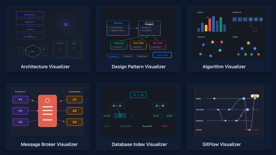
Architecture Visualizer
9 architectures. 33 modes. Animated request flows and dependency rule visualization.
Each architecture includes a Dependency Rules mode — highlighting valid and invalid dependencies. The visualization makes abstract rules (like "dependencies point inward" in Clean Architecture) tangible: valid connections light up green, violations turn red.
Design Pattern Visualizer
25 GoF patterns across three categories. Each with step-by-step UML animation, relationship visualization, and Dependency Rules.
Creational (8 patterns): Simple Factory, Static Factory, Factory Method, Abstract Factory, Builder, Prototype, Singleton, Object Pool.
Structural (7 patterns): Adapter, Bridge, Composite, Decorator, Facade, Flyweight, Proxy.
Behavioral (10 patterns): Observer, Strategy, Command, State, Chain of Responsibility, Iterator, Mediator, Memento, Template Method, Visitor.
For each pattern, the visualizer shows:
- UML animation — classes appear, relationships build, call flow animates step by step
- Dependency Rules — who depends on whom, where dependency inversion applies, which connections are valid
Algorithm Visualizer
The project is in active development. At the time of writing, several algorithms have already been implemented.
Message Broker Visualizer
3 brokers. 24 modes. Message routing, queue, partition, and consumer group visualization.
RabbitMQ (11 modes) — from simple queues to advanced scenarios: Direct, Fanout, Topic, and Headers exchanges, Dead Letter Queues, Priority Queues, Publisher Confirms. The visualization shows how an exchange routes messages to the correct queue based on routing key.
Kafka (5 modes) — partitioning, consumer groups, offset management, exactly-once semantics. Shows how messages distribute across partitions and how consumer groups balance load.
Redis (8 modes) — Pub/Sub, Streams with consumer groups, cluster mode. Covers both simple Pub/Sub and persistent Streams with processing acknowledgment.
Each mode animates the complete message path: from producer through broker routing to consumer delivery. This helps clarify the fundamental differences between delivery models — push vs pull, at-most-once vs at-least-once vs exactly-once.
Database Index Visualizer
4 databases. 17 interactive modes. Step-by-step visualization of index construction and query execution.
PostgreSQL — 5 modes: B-Tree with MVCC visualization (shows how row versioning interacts with the index, why VACUUM is needed, and what happens with dead tuples), Hash Index, GIN for full-text search, GiST for geometric data, BRIN for naturally ordered large tables.
MySQL — 5 modes: classic B-Tree, Hash Index, Composite Index (visualizes the leftmost prefix rule — making it clear why column order in composite indexes matters), Full-Text Search, EXPLAIN Plan.
MongoDB — 4 modes: Single Field, Compound Index, Multikey for arrays, Text Index.
Redis — 3 modes: Sorted Set (SkipList + Hash Table), Hash with rehashing visualization, Secondary Index.
The core value is the Index Scan vs Full Table Scan comparison. The visualizer shows every data page read: Index Scan traverses from root to leaf through 3 pages, while Full Table Scan sequentially reads all 47. The difference between O(log n) and O(n) stops being abstract — it's concrete pages on screen.
GitFlow Visualizer
11 branching strategies: Classic Git Flow, GitHub Flow, GitLab Flow, Trunk-Based Development, OneFlow, Release Flow, Forking Workflow, Environment-Based, Cherry-Pick, Ship/Show/Ask, Scaled Enterprise.
SVG animation shows branches, commits, and merges step by step. Each strategy is visualized through its complete cycle: from feature branch creation to release. The difference between GitHub Flow (single main branch, short-lived branches) and Classic Git Flow (develop, release, hotfix branches) becomes visible in motion, not just in description.
The tool is useful for choosing a branching strategy for a team: all 11 approaches can be reviewed sequentially, comparing complexity, number of parallel branches, and release process.
Links
All visualizers are collected on the Projects Page. Source code is open — GitHub repository. Issues and pull requests are welcome.
Visualization doesn't replace documentation and books. But it provides what text cannot — observation of the process.